
Thursday, October 11, 2007
Aidan - Final
After a little over two months, I finally finished Aidan's portrait. It was more complex than I first realized, with all the different textures - skin, hair, hat, shirt, bird bath, snail - but I'm happy with how it came out. Now I just need to find a good reference photo for Cole's portrait!

Tuesday, September 25, 2007
Aidan - WIP 5
I haven't gotten as many lunch hours or evenings to work on this as I would like, so it's moving along slowly but surely. I finished the subject of Aidan's interest - a snail that is hanging upside down on part of the bird bath. I've never drawn a snail before, so it was a challenge but fun. I actually picked up a snail the other day while the boys were playing with it and studied its shell to get an idea of how I might draw one. Another challenge with the bird bath was trying to make its texture different - it is aluminum, I think, and somewhat smooth on top but rougher on the sides. I also wanted it to stand out from Aidan's mouth, since it's overlapping. I hope I did OK.


Sunday, September 16, 2007
Aidan - WIP 4
I've finally finished Aidan's hat and face. I originally wanted to place the part of the bird bath that's blocking his mouth further to the right and then reconstruct his mouth, but after thinking about it and looking for other reference photos, I decided against it. I think I made the right decision, because I probably would have made him look like the Joker if I'd tried to guess what the obscured part of his mouth looked like.


Thursday, September 6, 2007
Aidan - WIP 3
I finished Aidan's hair, the shading beneath his hat, and most of the hat. Since his hat is a light khaki color, it loses a lot of detail on the left, since the sun is shining on it. I think I'll have to add some background to this drawing to define the edge of the hat.


Wednesday, August 29, 2007
Aidan - WIP 2
I worked a bit more on Aidan, adding his ear and starting the hair. There isn't much of it in this portait, since he's wearing a hat, just a few locks that typically hang down on his forehead. I'm afraid I may have messed up the tooth of the paper on his forehead to the viewer's left, since I can't seem to add any more graphite to darken it up. I'll keep trying.


Monday, August 27, 2007
Aidan - WIP 1
After I finished Grant's portrait, I felt very proud - I had never been so proud of one of my drawings before. I spent many hours on it, and took my time, applying lessons I'd learned from books and from my friends at the ArtPapa forums. I already had a photo of Aidan picked out that I wanted to use for the next one, but after a while, I realized I was dragging my feet about it. One day it occured to me that what was preventing me from working on another portrait was a fear of failure. I was afraid that I couldn't do as well (not to mention better) on another portrait as I'd done on Grant's. I don't expect my skills to improve markedly from one drawing to the next, but I do expect to learn from my mistakes, if nothing else. Still, weeks went by and I couldn't bring myself to start Aidan's portrait until one day I forced myself to.
I'm using a new paper, Arches 140 lb. Hot Pressed Watercolor, and graphite.


I'm using a new paper, Arches 140 lb. Hot Pressed Watercolor, and graphite.


Tuesday, August 21, 2007
Fear of failure
After feeling so good about my last drawing, the portrait of Grant, I find myself dragging my feet with my next drawing. I've chosen a picture of Aidan to do, which I think is really cute, and I've done the contours and started on one of his eyes, but for some reason, I'm afraid to continue. I've been dragging my feet with it, finding other things to do besides work on it, whereas with Grant's portrait, I couldn't wait to get to it to see how it would come out. I even bought nice paper to use with Aidan's portrait and everything. I realized this morning that I'm afraid to mess it up - I was so happy with Grant's portrait, I think subconsciously that I've convinced myself I can't top it. But I know I can. At this point, I've lost my drawing momentum and I need to just pick up the pencils again and continue. One of my goals for this week is to start it up again. Sigh...
Sunday, August 5, 2007
Grant - Final
Here is Grant's finished portrait. I have to say that I'm prouder of this drawing than ever I have done before. I used tips I've picked up from the many drawing books I have, and from the great people over at ArtPapa Forums. I couldn't have done it without their support.
I learned a lot on this portrait, and already look forward to my next one. I made some mistakes on this, and hopefully I learned from them. Maybe nobody will notice them but me!

I learned a lot on this portrait, and already look forward to my next one. I made some mistakes on this, and hopefully I learned from them. Maybe nobody will notice them but me!

Wednesday, August 1, 2007
Grant - WIP 5
Well, I decided to stick with the plaid shirt that Grant had on in the photo. After I started, I thought I had ruined the whole drawing, but after completing this part of the shirt, I think that even though the pattern does draw the eye to it, the lines direct the eye up towards the face. My intention is to have the viewer first notice the eyes, then the viewer's gaze will go down to the right, where the lines will lead to the left, and then up to the hair and back to the eyes. Whether this will actually work or not, I don't know. I plan on toning down the lines in the shirt a bit to make it less of a distraction and to set it back from Grant's face.
There's usually at least one point in every drawing when I think I've blown it and ruined the whole thing. In this drawing, that's happened with the hair and again with the shirt. I even resisted working on it for a few days while I thought about what to do with the shirt, looking at it a few times each day.
After the shirt is done, I plan on going back to sharpen up some points in the face and hair a tiny bit to give it slightly more focus.

Tuesday, July 24, 2007
Grant - WIP 4
Grant now has a full head of hair. It was tricky, because he's got some long locks that overlap others, and a lot of wave, so I had to be careful and do each lock at a time. I tried to keep the band of light consistent as well as the shading on the sides. Next I'll tackle the plaid shirt he's wearing, another first for me. Wish me luck.


Saturday, July 21, 2007
Grant - WIP 3
I finally worked up the nerve to start Grant's hair. This is the first time I've tried to create realistic hair - in the past, I'd do the face and then quickly top it off+ with hair that amounted to scribbles that somewhat followed the direction of hair growth. I'm happier with how this came out so far.


Saturday, July 14, 2007
Grant - WIP 2
I spent a little more time on Grant, giving him ears and a mouth. I've also done his neck, but haven't scanned that part yet. I'm frankly nervous about doing his hair - I'm very pleased with how it looks so far, and I don't have any experience really trying to do realistic hair.


Friday, July 13, 2007
Grant WIP 1
I'm taking a little break from eye studies - I literally have 20 or so sources for my studies, and it's become a little overwhelming (and repetitive). After studying Vanderpoel, it's all downhill from there anyway.
Having recently read J.D. Hillberry's "Drawing Realistic Textures in Pencil" and Lee Hammond's "How to Draw Lifelike Portraits from Photographs", I decided to try just that - drawing a portrait from a photograph. I chose my youngest son, Grant, whose 18 month portaits were taken just a couple of months ago. I liked the expression on his face in this one, and thought it would make a good model for my first serious portrait attempt. I've spent a few lunch hours and an evening on it so far, and have used mostly F, 2B and 3B graphite with just a little charcoal for the eyes and some accents. I think overall it's pretty good, but I may need to lighten it up a bit. I'm worried about the hair, because I haven't really had much experience doing realistic hair. We'll see how it goes.


Having recently read J.D. Hillberry's "Drawing Realistic Textures in Pencil" and Lee Hammond's "How to Draw Lifelike Portraits from Photographs", I decided to try just that - drawing a portrait from a photograph. I chose my youngest son, Grant, whose 18 month portaits were taken just a couple of months ago. I liked the expression on his face in this one, and thought it would make a good model for my first serious portrait attempt. I've spent a few lunch hours and an evening on it so far, and have used mostly F, 2B and 3B graphite with just a little charcoal for the eyes and some accents. I think overall it's pretty good, but I may need to lighten it up a bit. I'm worried about the hair, because I haven't really had much experience doing realistic hair. We'll see how it goes.


Tuesday, July 10, 2007
Eye Studies Part 6: Gary Faigin, "The Artist's Complete Guide to Facial Expressions"
There are lots of books that describe themselves as "definitive", but I haven't seen many that live up to that description as well as Gary Faigin's book, "The Artist's Complete Guide to Facial Expressions". Faigin not only goes into great detail about facial structures, and what the artist should be aware of above and below the surface, but it backs each observation up with numerous illustrations. This book rivals Vanderpoel's book in its detailed analysis of the underlying structure of the face, and it focuses mainly on what makes one face different from another, and how facial expressions change its appearance.


Monday, June 25, 2007
Eye Studies Part 5: George Bridgman, "Constructive Anatomy"
I've read that you either love Bridgman or you hate him. I tend not to like him so much, because his drawings, even though they are intended to give anatomical instruction, are more like grotesque exaggerations of human anatomy. Peoples' bodies don't really look like they do in his drawings - they're more like comic book illustrations where every feature is blown out of proportion. Perhaps this is to draw the student's attention to certain features. In any case, I find it distracting.
The section "The Eye" in Bridgman's book "Constructive Anatomy" (available for download from Internet Archive) contains a brief description of the anatomy of the eye structure, followed by several pages of Bridgman's eye drawings ("The Eye Socket: Wedges, Planes and Their Angles", "The Eye: Angular Opening Between the Lids", and "The Eye"). I did appreciate Bridgman's text, which is reminiscent of John Vanderpoel's descriptions (both books date from the early part of the 20th century), not just in its wording but how the matter is approached.


The section "The Eye" in Bridgman's book "Constructive Anatomy" (available for download from Internet Archive) contains a brief description of the anatomy of the eye structure, followed by several pages of Bridgman's eye drawings ("The Eye Socket: Wedges, Planes and Their Angles", "The Eye: Angular Opening Between the Lids", and "The Eye"). I did appreciate Bridgman's text, which is reminiscent of John Vanderpoel's descriptions (both books date from the early part of the 20th century), not just in its wording but how the matter is approached.


Wednesday, May 30, 2007
Eye Studies Part 4: JR Dunster, "How to Draw Eyes"
portrait-artist.org is "a portrait art tutorial site, with lessons on sketching and drawing faces, tutorials on digital art, an overview of art and drawing techniques, art supplies, book recommendations, anatomy, and much more." JR Dunster has created many tutorials to help aspiring artists who have an interest in drawing portraits.
Dunster's tutorial, "How to draw eyes, step-by-step drawing lesson", demonstrates to the reader how to perceive the eye, as well as how to render it in a drawing. He begins with a description of how to "see" the eye (Dunster recommends Betty Edwards' excellent "Drawing on the Right Side of the Brain" to his readers), using illustrations to show the eye's depth and shape, and reminds the reader not to forget the thickness of the eyelids (or the "tear duct thingie"!), and shows the subtle angles of the top lid. An important point that Dunster reiterates for the reader is that the iris is perfectly round, as is the pupil, which is perfectly centered within it. This seems like a simple point, but it's an important one - I've seen many drawings in which the iris is not round, nor is the pupil correctly centered.
After the overview of what to look for in the eye, Dunster goes into how he renders it, going over shading the iris for realism and shading the eyeball and adding eyelashes.
Ironically, his step-by-step diagram on how to draw the eye is, after four pages of overview, very brief. It consists of drawing an outline, followed by drawing in the lower lid, pupil, and highlight, and then adding shading and detail. To be fair, not only is most of this covered in the preceding pages, but as Dunster mentions, he does expect his reader to have some experience in drawing.
I did appreciate his "quick step-by-step of the eyebrow", which comes next, as it was useful to see how the shading should be deeper below the "brow line".
The last part of the tutorial is a brief description of what to notice when viewing the eye from the side.
I got many useful bits of information and tips from Dunster's tutorial, including his illustration of the basic shape of the eye (the widest part of the top of the eye is further in than the widest part of the bottom of the eye), and his suggestion about "suggesting" the thickness of the lower eyelid. I also thought it was useful to know that the upper eyelid covers about 1/3 (sometimes more) of the iris, and that the "white" of the eye is actually a "very, very pale peach, or pale greyish-peach" (I'm color blind and would never have noticed that).
Here are my eye sketches following Dunster's tutorial - the first is based on the one he uses in the tutorial, and the second is based on a photo of an eye, using Dunster's steps and mimicking his style.

Up next: Gary Faigin's "The Artist's Complete Guide to Facial Expressions"
Eye Studies Part 3: Brian Duey, "How to Draw a Realistic Eye"
From Vanderpoel's idealized eyes to Blake and Lawn's sketchy eyes, I move next (I'm going alphabetically after Vanderpoel, by the way) to Brian Duey's realistic style.
Mr. Duey's online tutorial is not a lesson in the construction of the eye, nor does it go into detail about why the eye is drawn a certain way. In his own words, the tutorial is intended "to show the different steps that I take in drawing a realistic eye". Duey's ability to photorealistically depict an eye is demonstrated in 15 steps, from the contour drawing to the cleanup and adding of minute details. His tutorial describes how to take a drawing of an eye to the next - or maybe highest - level. Using keen observation and careful use of shading and blending (this was my first exercise in using a blending stump, or tortillon), Duey explains the process he uses to make a "believable looking" drawing of an eye. I can only hope to attain such a level of talent one day.


The first drawing is based on the one in Duey's tutorial; the second was based on a photo of an eye by Dave King.
Wednesday, May 23, 2007
Eye Studies Part 2 - Wendon Blake and John Lawn, "Portrait Drawing: A Step-by-Step Art Instruction Book"
Let me say that in the course of my eye studies, I am going to encounter many different styles of drawing. Some strive for near photorealism, some are more sketchy, and some are more idealized, as I think Vanderpoel's are. The drawings in Wendon Blake and John Lawn's book, "Portrait Drawing: A Step-by-Step Art Instruction Book", are in the middle category. They are almost comic-book like in style, with lots of rough shading done by parallel lines. I intend to mimic the style of each author when following their instructions.
There wasn't much new in this book, I'm afraid, as its instructions are of the Betty Edwards draw-what-you-see school. Not much here on eye structure or why the eye looks the way it does, or even how to draw the iris to give the illusion of corneal transparency. It's really more of a draw-by-the-numbers book.
There are four examples, the front view, the 3/4 view, the side view, and the looking-down view. Each example has four steps to follow: 1) the contour drawing, 2) darkening and rounding out the lines, 3) blocking in tones, and 4) strengthening the tones and adding final details. It illustrates a specific way of shading, which I have tried to duplicate in my drawings. The first, third, and fifth drawings I copied from the book, and for the other two, I followed the steps in the book while drawing eyes from a couple of photos.


Eye Studies Part 1 - John Vanderpoel, "The Human Figure"
Since it was Mark Kennedy's post on John Vanderpoel's "The Human Figure" that got me started on my eye studies, I thought that would be the most logical place to start.
Although Vanderpoel's book isn't necessarily a how-to-draw-it book, it goes into great detail about the anatomy of the eye, as well as the structure of the eye socket and the muscles that surround the "orbit" as he calls it. As Mark pointed out, understanding Vanderpoel's descriptions sometimes requires multiple readings, but it's well worth it. He wants the reader to be able to visualize not just the physical aspects of the eye structure, but how shadow and light affect its appearance. Reading this was a little bit like reading philosophy in college - I'd read a passage over and over until I fully understood it. Believe me, it opened my eyes, so to speak.
Here are some eye studies based on Vanderpoel's drawings.


Thursday, May 17, 2007
May is eye month!


Having finished "Drawing on the Right Side of the Brain" (I admit, I skipped the last chapter about colors. I'm color blind, and I don't have any interest in adding color to my drawings at this point, because it would just mess them up. Besides, I'm mainly interested in learning technique and skills right now, so color can come later maybe.), I was inspired by Mark Kennedy's post on eyes to turn my attention to just that for a while. When I was younger, I would draw whole pages of eyes that I'd find in my sister's magazines. I'm going to focus (pun intended) on them again, starting with the examples from "The Human Figure" by J. H. Vanderpoel, which I just bought. After that, who knows. I intend to study skull structure, follow some of the tutorials I've found online, and take a look (ooh, there I go again) at some of the masters. This will probably take me through June, and from there, we'll see where I go.
Sunday, May 6, 2007
Drawing on the Right Side of the Brain - Portrait - Rod Serling
For my last portrait exercise from "Drawing on the Right Side of the Brain" (I know, I was supposed to use a real live person and one with a hat, so sue me), I decided to draw one of the geniuses of television, Rod Serling. I've always thought he had an interesting face, and this portrait is from his later, "Night Gallery" years.
It's apparent to me that I need to work on my shading more to create a better range of values, and I think I need to work on measuring. I think I'm going to try loosening up my pencil and not pay so much attention to little details. We'll see.


It's apparent to me that I need to work on my shading more to create a better range of values, and I think I need to work on measuring. I think I'm going to try loosening up my pencil and not pay so much attention to little details. We'll see.


Wednesday, May 2, 2007
My first sketch
With the recent posts on sketching from Temple of the Seven Golden Camels and ASIFA-Hollywood Animation Archive, I was inspired to do something I'd never done before: sketch something from real life. It's true - I have always been intimidated for some reason by drawing something that's live and in 3-D, so I've copied things from print. I know, it's cheating, and real artists would never do such a thing, but I'm not a real artist. I have never gone to art school. I just like to draw. But I'm trying. Please don't hold it against me.
So in order to hone my drawing skills, I got myself a pen and during today's lunch break, I drew a scene from outside my office window. Soon I'll actually venture outside and try drawing people (I work at a university, so there is no shortage of unsuspecting animated young people to practice on). Maybe it's appropriate that for my humble beginnings of sketching, I chose a garbage can. Anyway, without further ado, here is my first sketch (which is also my first attempt at hashing).

So in order to hone my drawing skills, I got myself a pen and during today's lunch break, I drew a scene from outside my office window. Soon I'll actually venture outside and try drawing people (I work at a university, so there is no shortage of unsuspecting animated young people to practice on). Maybe it's appropriate that for my humble beginnings of sketching, I chose a garbage can. Anyway, without further ado, here is my first sketch (which is also my first attempt at hashing).

Animation School Lesson 5 - Line of Action, Silhouettes - Part Two
Here are some line of action drawings and a silhouette drawing taken from John K's lesson and his post on silhouettes. I hope you like them. How am I doing?


ASIFA-Hollywood Animation Archive: Meta: The $100,000 Animation Drawing Course- Lesson 5


ASIFA-Hollywood Animation Archive: Meta: The $100,000 Animation Drawing Course- Lesson 5
Friday, April 27, 2007
Animation School Lesson 5 - Line of Action, Silhouettes - Part One
Here are the exercises from the Preston Blair book (I will post the Tinkerbell, Wart, and a Clampett drawing from John K's site later, since I haven't scanned them yet). As I mentioned in my last post, this was my introduction to line of action. I'd read somewhere that animators used a red pencil for line of action and blue pencil for the construction, so I used the red pencil for the first couple and ended up dropping it since it was too distracting and covered up facial details.
Incidentally, I got a nice comment from Jack Ruttan when I was halfway through this lesson. He suggested that my lines could be livelier, and after I thought about it for a while, I think I understood what he was saying. I had been trying to carefully trace my construction lines so I didn't mess up my drawings, but artists' lines are usually done quickly and have more flow to them. I have been trying to do that, and as he says, it will come with more practice. Thanks, Jack.


ASIFA-Hollywood Animation Archive: Meta: The $100,000 Animation Drawing Course- Lesson 5
Animation School Lesson 5 - Understanding the Line of Action
One thing I've noticed about Preston Blair's book is that it's big on illustrative examples, but is weak when it comes to details about why something is done. John K and Stephen Worth usually provide a bit more details, but I still like to look around to get other perspectives. I don't mean any disrespect, but I think they sometimes forget that some members of their audience are not professional animators.
I'd never worked with Line of Action before, and all I got from John K's lesson was that it helps your poses "read" by making them clear and understandable, and gives them a distinct non-ambiguous direction. They can be obvious and exaggerated, and details follow the line of action and don't go in opposite directions.
Well, that's fine, but again, this was my first introduction to line of action. Nothing I found online could tell me exactly how to draw one. I gather from the examples that it usually follows the character's body, and you can infer from some of the details in the examples where it's supposed to go, but should it follow the head? The hands? Can a pose have more than one line of action? I'm thinking specifically of the second Clampett drawing and the drawing of Wart. Does the line of action on the cat with the lightbulb above his head go through his head or his hand?
Hoping to find some insight, I found some good information on the always-great Temple of the Seven Camels and Animation Apprentice.
From Temple of the Seven Camels, "More on Line of Action":
"A good Line of Action... helps organize what you're trying to say into one thought. Any drawing should only try to say one thing."
"Always keep the line-of-action simple. I think a gesture, in order to have any kind of punch to it, needs to be based on either a straight line, a curve, or an "S" curve. Those three types of lines have direction and force to them. Anything else, like a zigzag or a more complicated series of curves, loses its ability to convey an action or direction."
"If you push a line of action too far, or in the wrong way, you can sacrifice the structure of what's underneath and you're left with something that feels like it's made out of jelly with no skeleton - that's not good."

From Animation Apprentice, "Learning Line of Action":
"You have a very strong forward slanting LoA (line of action), and you know the character is really determined and single minded. You have a strongly backward slanting LoA, or better yet a curve, and you know the character is probably desperately trying to get away from whatever is in front of it. And the S-Curve line of action is even more fun - it can show two different intents, pulling the character in different directions."
Temple of the Seven Golden Camels also has a really great example from the book "The Complete Guide to Drawing, Illustration, Cartooning and Painting" by Willard Mullins. The baseball player page provides several examples where the line of action is really easy to see, even for a rookie like me.

In Temple of the Seven Golden Camels' "Simplicity, Appeal, Line of Action, a lot of blabbity blah and Jordi Bernet", Mark gives some examples from the artist Jordi Bernet. "Directional drawing is easier when you draw SIMPLY. One of the keys to really directional drawing is to make EVERY line on the figure 'point' the way you want it to. Nothing on the figure fights the directional line." I really appreciated seeing how the lines in the character's details, from facial lines to clothing lines to the direction of the character's gaze, can be used to enhance and support the line of action.
I didn't intend for this to be a rant, and again, I mean no disrespect to Preston Blair, John K or Stephen Worth. Blair shows us what line of action means in the form of illustrations, John K explains why it should be done, but I was still left wondering how it can be done when you're not just copying from Blair's book. I think I understand it better now, but if anyone out there has any insights, I would really appreciate it if you'd leave them in the comments.
I'll post my drawings in another post and will shut up now.
ASIFA-Hollywood Animation Archive: Meta: The $100,000 Animation Drawing Course- Lesson 5
I'd never worked with Line of Action before, and all I got from John K's lesson was that it helps your poses "read" by making them clear and understandable, and gives them a distinct non-ambiguous direction. They can be obvious and exaggerated, and details follow the line of action and don't go in opposite directions.
Well, that's fine, but again, this was my first introduction to line of action. Nothing I found online could tell me exactly how to draw one. I gather from the examples that it usually follows the character's body, and you can infer from some of the details in the examples where it's supposed to go, but should it follow the head? The hands? Can a pose have more than one line of action? I'm thinking specifically of the second Clampett drawing and the drawing of Wart. Does the line of action on the cat with the lightbulb above his head go through his head or his hand?
Hoping to find some insight, I found some good information on the always-great Temple of the Seven Camels and Animation Apprentice.
From Temple of the Seven Camels, "More on Line of Action":
"A good Line of Action... helps organize what you're trying to say into one thought. Any drawing should only try to say one thing."
"Always keep the line-of-action simple. I think a gesture, in order to have any kind of punch to it, needs to be based on either a straight line, a curve, or an "S" curve. Those three types of lines have direction and force to them. Anything else, like a zigzag or a more complicated series of curves, loses its ability to convey an action or direction."
"If you push a line of action too far, or in the wrong way, you can sacrifice the structure of what's underneath and you're left with something that feels like it's made out of jelly with no skeleton - that's not good."
From Animation Apprentice, "Learning Line of Action":
"You have a very strong forward slanting LoA (line of action), and you know the character is really determined and single minded. You have a strongly backward slanting LoA, or better yet a curve, and you know the character is probably desperately trying to get away from whatever is in front of it. And the S-Curve line of action is even more fun - it can show two different intents, pulling the character in different directions."
Temple of the Seven Golden Camels also has a really great example from the book "The Complete Guide to Drawing, Illustration, Cartooning and Painting" by Willard Mullins. The baseball player page provides several examples where the line of action is really easy to see, even for a rookie like me.
In Temple of the Seven Golden Camels' "Simplicity, Appeal, Line of Action, a lot of blabbity blah and Jordi Bernet", Mark gives some examples from the artist Jordi Bernet. "Directional drawing is easier when you draw SIMPLY. One of the keys to really directional drawing is to make EVERY line on the figure 'point' the way you want it to. Nothing on the figure fights the directional line." I really appreciated seeing how the lines in the character's details, from facial lines to clothing lines to the direction of the character's gaze, can be used to enhance and support the line of action.
I didn't intend for this to be a rant, and again, I mean no disrespect to Preston Blair, John K or Stephen Worth. Blair shows us what line of action means in the form of illustrations, John K explains why it should be done, but I was still left wondering how it can be done when you're not just copying from Blair's book. I think I understand it better now, but if anyone out there has any insights, I would really appreciate it if you'd leave them in the comments.
I'll post my drawings in another post and will shut up now.
ASIFA-Hollywood Animation Archive: Meta: The $100,000 Animation Drawing Course- Lesson 5
Saturday, April 21, 2007
Animation School Lesson 4 - 2 legged characters-full body
Here is lesson four from Preston Blair's book (Why did John K choose to skip "Body Built from Rounded or Circular Forms" and "The Skeleton Foundation"? I guess I'll have to go back and do them myself, because Tom and Jerry are my favorites).
This lesson was an extension of what we learned in the first two lessons - that basic forms and construction lines need to be drawn first, followed by basic forms and then details that should wrap around the form to give it a three-dimensional feel.
I hope you like these. I haven't done the Photoshop comparison because I don't have Photoshop on my computer, but I think they're pretty close, so I'm happy with them.
Please let me know if there are any areas I should improve upon!


ASIFA-Hollywood Animation Archive: Meta: The $100,000 Animation Drawing Course- Lesson 4
Friday, April 20, 2007
Drawing on the Right Side of the Brain - Portrait - Isabella Brant
I loved this drawing, "Isabella Brant" (1621), by Peter Paul Rubens from the first time I saw it, so I thought I'd give it a try. I'm fairly happy with how it came out, although I see some problems in the left side of the drawing, and I wish I was better at shading. That's ok, because that's the next chapter of the book. I also seem to have problems with mouths, so maybe after I'm done with this book I'll focus on them for a while. We'll see.
I welcome any feedback anyone might have about how I might improve my drawings. Am I getting any better?


I welcome any feedback anyone might have about how I might improve my drawings. Am I getting any better?


Saturday, April 14, 2007
Drawing on the Right Side of the Brain - Portrait
For my first head-on portrait for my "Drawing on the Right Side of the Brain" exercise, I chose my old favorite, Boris Karloff. Hey, he's got a great face! As with all the others, I'm happy with this, although the size of that ear on the left side keeps bothering me. I might have to correct it.


Tuesday, April 10, 2007
Animation School Lesson 2 - Squash and Stretch on heads
This lesson was kind of fun, because it was interesting to learn about squash and stretch. It's one of those things you grow up watching in cartoons, but only after you find out about how the Disney animators pioneered the technique that you can appreciate it.


ASIFA-Hollywood Animation Archive Project Blog: Meta: The $100,000 Animation Drawing Course- Lesson 2


ASIFA-Hollywood Animation Archive Project Blog: Meta: The $100,000 Animation Drawing Course- Lesson 2
Drawing on the Right Side of the Brain - 3/4 Profiles Part 2
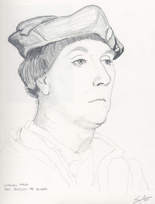
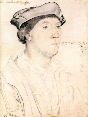
Continuing my profile exercises from "Drawing on the Right Side of the Brain", here are two works based on the works of old masters. The first one I'm really happy with - it's based again on a Hans Holbein the Younger drawing, "Portrait of Sir Richard Southwell" c. 1537.
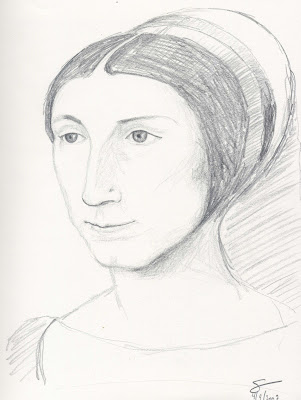
I'm not as happy with the second one, based on Jean Clouet's "Portrait of a Young Woman". The biggest problem is that the drawing I had to base it on is only about 1 1/2" high, and my drawing is 9 or 10 inches high, so there wasn't much detail to follow. I guess I got the proportions mostly correct, so the exercise wasn't a complete failure.
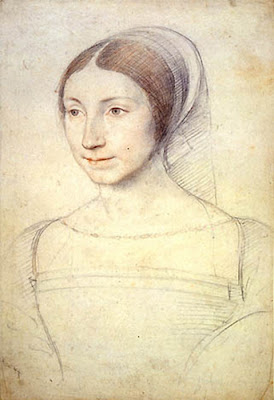


I'm not as happy with the second one, based on Jean Clouet's "Portrait of a Young Woman". The biggest problem is that the drawing I had to base it on is only about 1 1/2" high, and my drawing is 9 or 10 inches high, so there wasn't much detail to follow. I guess I got the proportions mostly correct, so the exercise wasn't a complete failure.


Subscribe to:
Comments (Atom)